
Menu
Eco-conscious color palettes are transforming interior spaces by promoting both sustainability and serenity. Choosing colors that reflect environmental awareness not only beautifies your home but also reinforces a commitment to the planet. Through mindful selection of paints, finishes, and décor hues, you can foster interiors that feel as good as they look while treading lightly on the earth. This guide explores how sustainable shades inspire tranquility, foster well-being, and support eco-friendly lifestyles in every room of your home.
The Benefits of Green Design Choices
The Psychological Impact of Natural Colors
Colors drawn from nature, such as earthy greens, soft browns, and serene blues, have a calming effect on the mind and body. These hues can reduce stress and encourage relaxation, making them ideal for spaces dedicated to rest and rejuvenation. By bringing outdoor-inspired shades indoors, you foster an environment that feels balanced and nurturing. Research suggests that natural color palettes can improve mood and enhance overall well-being, making your home a true sanctuary. Their subtlety and neutrality also allow for versatile styling, supporting sustainable design principles by minimizing the need for constant aesthetic updates.
Decreasing Environmental Footprint with Paint Choices
Conventional paints often contain volatile organic compounds (VOCs) and synthetic dyes that can contribute to indoor air pollution and environmental contamination. Eco-conscious palettes embrace low-VOC or VOC-free alternatives, using natural earth pigments and water-based formulas that are safer for you and the environment. By choosing paints and finishes from responsible manufacturers, you actively reduce your home’s environmental footprint. The use of sustainable paints supports healthier indoor air quality and limits hazardous waste during manufacture and disposal. In this way, color choice becomes a vital act of environmental stewardship within the home.
Harmonizing Spaces through Cohesive Palette Selection
Sustainably inspired color palettes encourage a cohesive flow throughout your home, ensuring every room feels connected yet unique. Selecting complementary natural tones avoids jarring contrasts and creates a sense of harmony. This approach not only visually expands your living areas but also encourages mindful, intentional decorating. A cohesive color scheme minimizes impulsive purchases and allows for easier repurposing of furnishings, both key aspects of eco-conscious living. Over time, this mindfulness cultivates lasting satisfaction with your living space and a reduced desire for unnecessary consumption.
Nature’s Influence on Sustainable Palettes
Embracing Earth-Inspired Neutrals
Earth-inspired neutrals, such as sandy beiges, clay taupes, and gentle grays, form the backbone of many eco-conscious palettes. These shades evoke the stability and warmth of natural settings, making interiors feel welcoming and restful. Their inherent versatility makes them ideal for both contemporary and traditional home designs. By focusing on environmentally friendly finishes in these hues, you can enjoy their beauty without guilt, as many are formulated with natural pigments and sustainable binders. Earthy neutrals serve as a calming backdrop for bolder accents, art, or furnishings, ensuring they remain relevant as styles change.
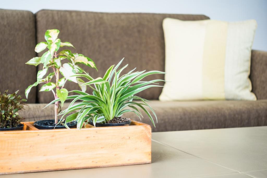
Celebrating Botanical Greens
Botanical greens, ranging from mossy sages to vibrant leaf tones, infuse interiors with a sense of freshness and vitality. They symbolize growth, harmony, and connection to the earth—values central to eco-conscious living. Incorporating green tones can visually link your rooms to outdoor gardens or tree-filled views, reinforcing the bond between indoor and natural environments. Sustainable green paints are often derived from mineral pigments or plant-based dyes, providing rich coloration free of harmful chemicals. These shades can be used throughout the home to anchor spaces or as dynamic accents that invite relaxation and renewal.
Drawing from Water and Sky
Shades inspired by water and sky—think tranquil blues, soft aquas, and airy whites—bring an element of coolness and openness to home design. These colors reflect the clarity of lakes, rivers, and wide open skies, encouraging a sense of peacefulness and expansion within your interiors. Water- and sky-inspired tones help manipulate light and space, making small rooms feel larger and brighter. Many sustainable paints in these colors utilize eco-friendly manufacturing processes and responsibly sourced ingredients, furthering their environmental benefits. Using water and sky palette elements enhances your home’s ambiance while subtly nodding to the planet’s most precious resources.
Crafting Your Eco-Friendly Color Scheme
01
Choosing eco-friendly paints is a foundational step in creating a sustainable color scheme. Ethical paint brands prioritize responsible sourcing, biodegradable ingredients, and transparent manufacturing practices. Seek out companies that provide certifications for low or zero VOC content and use renewable, organic, or recycled materials in their formulations. Purchasing from these brands ensures your color selections are as gentle on the earth as they are attractive in your home. This commitment also supports industry shifts toward more sustainable methods, rewarding companies that champion environmental stewardship in every aspect of production.
02
Incorporating color doesn’t stop at paint—it continues throughout your home with finishes, decor, and soft goods. By selecting recycled or naturally dyed textiles, you reinforce your eco-conscious palette while supporting ethical production. Fabrics made from organic cotton, linen, hemp, or recycled fibers offer rich, lasting color while avoiding synthetic chemicals. Mix and match cushions, throws, curtains, or rugs in complementary sustainable shades, creating visually dynamic yet harmonious environments. Careful textile choices enhance the green credentials of your home and encourage a fully integrated approach to eco-responsible design.
03
A key principle of sustainable color selection is choosing hues that stand the test of time. Trend-driven colors can quickly become dated, prompting wasteful redecorating. Instead, prioritize classic tones—soft whites, soothing blues, earthy browns, or gentle greens—that adapt to different seasons and evolving design trends. These enduring shades reduce the urge to frequently update your space, fostering long-term satisfaction. Investing in timeless colors, especially through high-quality, sustainable products, contributes significantly to resource conservation and more mindful consumption habits within the home setting.